Back to Blogs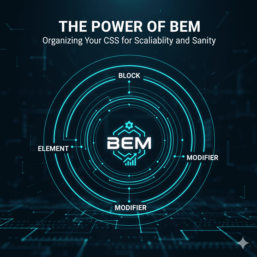
February 20, 2025
Mastering the BEM Naming Convention in CSS
Explore the pros and cons of Tailwind CSS vs traditional component styling.
Ever found yourself lost in a labyrinth of CSS, battling specificity wars, or fearing that a single class change might break half your website? You're not alone. As projects grow, CSS can quickly become unwieldy without a clear organizational strategy. Enter **BEM: Block, Element, Modifier**.
BEM is more than just a naming convention; it's a methodology that helps you write maintainable, scalable, and explicit CSS. It focuses on creating independent blocks of code that can be reused and combined without conflicts, making your codebase predictable and easier to understand.
## What is BEM?
BEM breaks down your UI into three distinct entities:
1. **Block:** A standalone, independent component that is reusable. It could be a `header`, `button`, `card`, `menu`, or `form`.
* **Examples:** `button`, `card`, `header`
2. **Element:** A part of a block that has no standalone meaning and is semantically tied to its block.
* **Examples:** `button__icon`, `card__title`, `header__logo`
3. **Modifier:** A flag on a block or an element that changes its appearance, behavior, or state.
* **Examples:** `button--primary`, `button--disabled`, `card--featured`, `header__logo--small`
## How BEM Naming Works
The naming convention follows a simple, intuitive pattern:
* **Block:** `.block`
* **Element:** `.block__element` (two underscores)
* **Modifier:** `.block--modifier` or `.block__element--modifier` (two hyphens)
Let's look at an example:
```html
<button class="button button--primary">
<span class="button__icon"></span>
Click Me
</button>
<div class="card card--featured">
<img class="card__image" src="image.jpg" alt="A nice image">
<h2 class="card__title">Featured Product</h2>
<p class="card__description">This is a great product you should buy!</p>
<button class="card__button">Buy Now</button>
</div>